Responsive Design Principles You Must Know
Author: Ondřej Frait
•Ondřej FraitPublished on:10.07.2025
•Design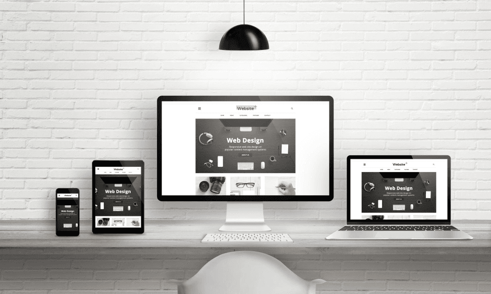
Responsive design has become a necessity for every modern web page. With an increasing number of users accessing the internet via mobile devices, it is crucial that your website adapts perfectly to various screen sizes. The goal of responsive design is to ensure optimal display and user experience regardless of whether the user is viewing your website on a desktop computer, tablet, or smartphone.
Why is Responsiveness Important?
- User Experience: Responsive design ensures that users won't have to scroll horizontally or zoom in on text, which leads to a better experience.
- SEO: Google prefers responsive websites. Mobile-friendliness is a ranking factor.
- Cost: A single version of the website for all devices is more efficient to maintain than separate mobile sites.
Core Principles
Responsive design is based on several pillars:
- Fluid Grids: Using percentage widths instead of fixed pixels.
- Flexible Images and Media: Media adjusts to its container to prevent overflow.
- Media Queries: CSS rules that allow applying different styles based on screen size or device type.
- Mobile-First Approach: Design starts from the smallest screens and progressively enhances.
Investing in responsive design always pays off in the long run.